Nail Design Abstract: 9 Looks Ranked from Best to Skip
You have found yourself scrolling past the same perfect French tips for months, and suddenly one nail design abstract stops your thumb completely. It looks random, it looks deliberate, and somehow it looks better than anything symmetrical you have seen. That reaction is not accidental. Abstract nail art works on a visual and psychological level that most trend roundups never explain — and knowing why certain looks hold attention while others fall flat changes how you choose and wear them. This guide ranks nine styles honestly, covers what makes each one work, and tells you exactly which are worth your time.
Why Abstract Nail Art Keeps Outperforming Other Trends
Abstract nail art operates differently from other manicure styles because it plays with contrast, imperfection, and visual tension simultaneously. A perfect, uniform manicure resolves quickly for the eye — the brain processes it and moves on. Abstract nail art does the opposite. Each nail functions as a small, individual composition. Because no two nails match exactly, the eye keeps scanning, searching for a pattern that never fully resolves.
That sustained visual engagement is why abstract designs photograph so well. Every slight movement of the hand changes how light catches the design, especially when a glossy top coat or a fleck of metallic foil sits over the base. The design literally changes on camera.
The Color Logic Behind Every Strong Abstract Look
Strong abstract manicures rely on contrast — not chaos. Bright against neutral. Soft against sharp. Smooth against textured. That contrast gives the eye just enough structure to follow without making the design predictable. Neons on a cream base work for the same reason a soft blush swipe works on a clean white nail: one element anchors, the other creates movement.
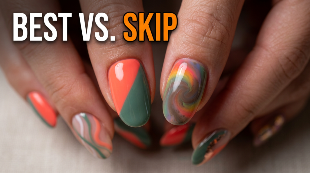
9 Abstract Nail Looks Ranked Honestly
1. Diagonal Color Block — Best Overall
Two or three colors split at a sharp diagonal angle across each nail. Simple to execute, high visual impact, and extremely forgiving if the line wavers slightly. Works equally well in neons, pastels, or neutrals. This look photographs cleanly and holds up across skin tones.
2. Negative Space with Wavy Lines
A clean base coat with thin, wavy lines in a single contrasting color, leaving sections of the natural nail or base visible. The empty space becomes part of the design rather than an absence. This is the most editorial of the accessible looks — it reads expensive and intentional with minimal product.
3. Soft Blob Manicure
Irregular rounded shapes in two complementary colors, placed loosely across each nail. Beginner tutorials build this one in under ten minutes using a standard nail art brush or even a toothpick. The imprecision is the point. In practice, this works best in muted or pastel tones — bold colors can make blobs look accidental rather than considered.
4. Metallic Foil Accents on a Neutral Base
A nude or sheer base with small, irregular pieces of gold or silver foil pressed into the wet polish. The foil catches light in a way that changes completely from different angles. However, foil placement is less forgiving than it looks — too much foil and the design loses the contrast that makes it work.
5. Minimalist Line Art
Thin black lines drawn in irregular geometric patterns over a clean white or nude base. This is the most wearable abstract style for professional settings. It also requires the steadiest hand of any style on this list. A dotting tool or fine liner brush makes it achievable, but beginners should expect a learning curve.
6. Brushstroke Swipe
A single, bold swipe of color across the center of a neutral base, like a brushstroke that crosses the nail. One coat, one movement, maximum impact. The result looks deliberately editorial when executed with confidence. It also looks like a mistake when done hesitantly — which means committing to the stroke matters more than perfecting it.
7. Monochromatic Abstract
Multiple shades of the same color family applied in irregular shapes or swipes. Caramel on nude on ivory, or navy on cobalt on powder blue. This approach creates depth without the visual noise of contrasting colors, which makes it an excellent choice when the goal is subtle rather than bold.
8. Neon Splatter
A neutral or black base with small dots or splatter marks in two to three neon shades. This is the highest-energy look on the list and also the hardest to pull off without crossing into messy territory. The dots need to stay small and feel intentional. Large, irregular blobs in bright colors lose the art-forward quality that makes abstract nail design compelling.
9. Rainbow Gradient Swirl — Skip for Most
Blending multiple rainbow shades across the nail in a swirled pattern sounds striking but frequently results in a muddy, overworked finish unless the technique is precise. The colors blend into each other, losing the contrast that drives all the best abstract work. Most people attempting this at home end up with a brown-grey center where the colors meet. Skip unless you have serious practice with wet blending.
How to Build an Abstract Nail Look That Actually Works
The strongest abstract manicures share one quality: one clear idea, executed with confidence. A design with five competing elements — stripes and blobs and foil and dots and a swipe — loses the visual tension that makes abstract art interesting. A design with one or two elements, placed deliberately, always reads more intentional.
The Practical Build Order
Start with a clean base coat — always. Then select two to three colors maximum. Choose colors that either contrast sharply or sit within the same family. Apply the largest, simplest element first. Then layer the smaller accent detail over it once the base dries. Finish with a high-gloss top coat, which increases light reflection and makes every element read more deliberately.
As Who What Wear’s nail artist roundup on abstract nail trends notes, the most-pinned and most-recreated abstract designs share a clear structural logic underneath the apparent randomness — negative space, a defined focal element, and deliberate color placement, not freestyle chaos.
When to Leave Negative Space
Negative space — the parts of the nail you do not paint — is a design element, not an empty area. The best abstract nail art uses it to give the painted sections room to breathe. A wavy stripe on a bare nail base reads more sophisticated than the same stripe on a fully painted background. When in doubt, leave more bare nail than feels natural. The restraint almost always improves the final result.
Abstract Nail Art for Every Setting
One of the reasons nail design abstract styles have outlasted other beauty micro-trends is their adaptability. The same structural approach produces wildly different outcomes depending on color choice.
Minimalist neutral abstract nails — cream and taupe diagonal blocks, or thin black lines on nude — fit easily into professional environments where louder nail art might distract. Bold neon abstract nails in the same diagonal block format communicate a completely different aesthetic identity. The technique stays constant. The color choice does the contextual work.
This flexibility also explains why abstract nail content performs so strongly on short-form platforms. A design that films in sixty seconds, photographs differently from every angle, and can be recreated by someone with basic tools hits every criteria for content that spreads quickly.
Final Takeaway on Abstract Nail Trends
The looks that rank highest on this list share the same underlying logic: contrast, restraint, and one confident central idea. Diagonal color blocks and negative space designs lead because they apply those principles most directly. The looks that disappoint — heavy gradients and overcrowded splatter — fail because they abandon the contrast that makes abstract work visually compelling.
Pick one technique, choose two colors that interact clearly, and commit to the application. An imperfect confident stroke reads better than a hesitant precise one. Start with the diagonal block or negative space wavy line look, build your eye for what works, and layer in more advanced techniques from there. The best abstract manicure you do will probably surprise you.
FAQ — Nail Design Abstract
Q1: What makes a nail design abstract rather than just messy?
A: A true nail design abstract has an underlying compositional logic — contrast, negative space, or a clear focal element — even when the shapes appear random. Messy nails lack that intentional structure. The difference shows up clearly in photos: abstract designs hold visual interest, while unintentional designs just look unfinished.
Q2: Which abstract nail designs work best for beginners?
A: Diagonal color blocks and soft blob manicures are the most forgiving for beginners because their imprecision reads as intentional. Both require only a standard nail brush and two colors. Negative space line art and brushstroke swipes produce strong results but need a steadier hand and a fine liner brush.
Q3: How do I choose colors for an abstract nail design?
A: Start with either a sharp contrast pairing — for example, black on white, or coral on sage — or a monochromatic pairing within one color family. Two colors almost always produce a cleaner result than three or more. The contrast between the base and the accent color is what gives the design its visual tension.
Q4: Can abstract nail art work in a professional office environment?
A: Yes — the key is staying in neutral or muted tones. Thin black line art on a nude base, or a soft taupe and cream diagonal block, read as polished rather than casual. Bold neons and heavy splatter patterns work better for personal or social settings where expressive nail art fits the context.
Q5: How long does an abstract nail design last compared to a regular manicure?
A: Lifespan depends on product choice, not the abstract style itself. Gel polish base coats extend any nail art to two to three weeks. Regular polish typically lasts five to seven days before chipping begins at the tips. Applying a quality top coat every two to three days extends the life of any design significantly.
Muhammad Awais is the founder of PeakRank Agency LLC, a white-label link building company helping SEO agencies and SaaS brands grow organic traffic through editorial guest posts and contextual link placements. With hands-on experience as a Senior SEO Specialist and Link Builder, he manages a vetted network of 2,000+ quality websites across multiple industries. His focus is on niche-relevant, white-hat link building that delivers real, long-term results.